What we created
GoAbroad are a leading international education and experiential travel resource with long innings within their industry of over 20 years.
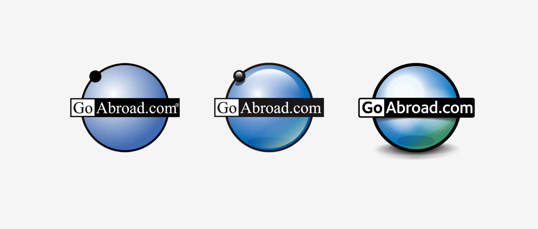
Their logo, having been with them and served them well from the start, was showing signs of age and required an update. The client had requested that their brand required modernising to stay relevant and fresh against their competitors whilst retaining elements of the brand that would be recognisable to their existing client base.
We approached this by starting to look at minor changes to the choice of font, choosing a sans serif font over their old serif font, rounding and smoothing the lozenge and reworking the main globe element. Both the full round logo and also a simplified and horizontal format lozenge were created to provide full range of application across both print and digital uses.
The result was a logo rework that remains identifiable to their customers and clients but brought into the modern day by subtle alterations to its form, colour and typography.
Colors & Material
Go Abroad blue
#0071ba
GoAbroad Grey
#292b31
GoAbroad Green
#4e927b


Let’s work together
"*" indicates required fields
More info
We are passionate about using creativity and technology to innovate and transform ideas into beautiful experiences. If you are too, get in touch with us now.
For a free introduction/discovery call please book a meeting slot using the button below.
Email: damien@tripsixdesign.co.uk
Call: +1 702 934 1546 (US)


