Gate One

Gate One had been using the branding and logo you see to the right for many years with their tagline and company  ethos at the time centered around ‘the ripple effect’.

As their business grew and expertise within their field they wanted a bold new brand update that better represented their position within their sector.

Their new ‘ripple symbol’ encapsulates their DNA, with each strand represnting different facets of their business offering (Leadership, Capability, Agility and Ownership).

The colour theme of their symbol and wordmark reflects the care, passion, loyalty, humanity, warmth, approachability and dynamism they hold true to their core.

Barcelona SAE

BSAE have been operating for over 10 years and they wanted a super subtle update to their original existing logo (shown to the right). some subtle work wa done to the typography and also the trencadis pattern and gradient was cleaned up and then used to form the basis of  their wider branding.

Beyond their logo, what did change massively was their branding with a much broader expansion and establishing of brand assets that were used across print and digital marketing.

GoAbroad

GoAbroad are a leading international education and experiential travel resource with long innings within their industry of over 20 years.

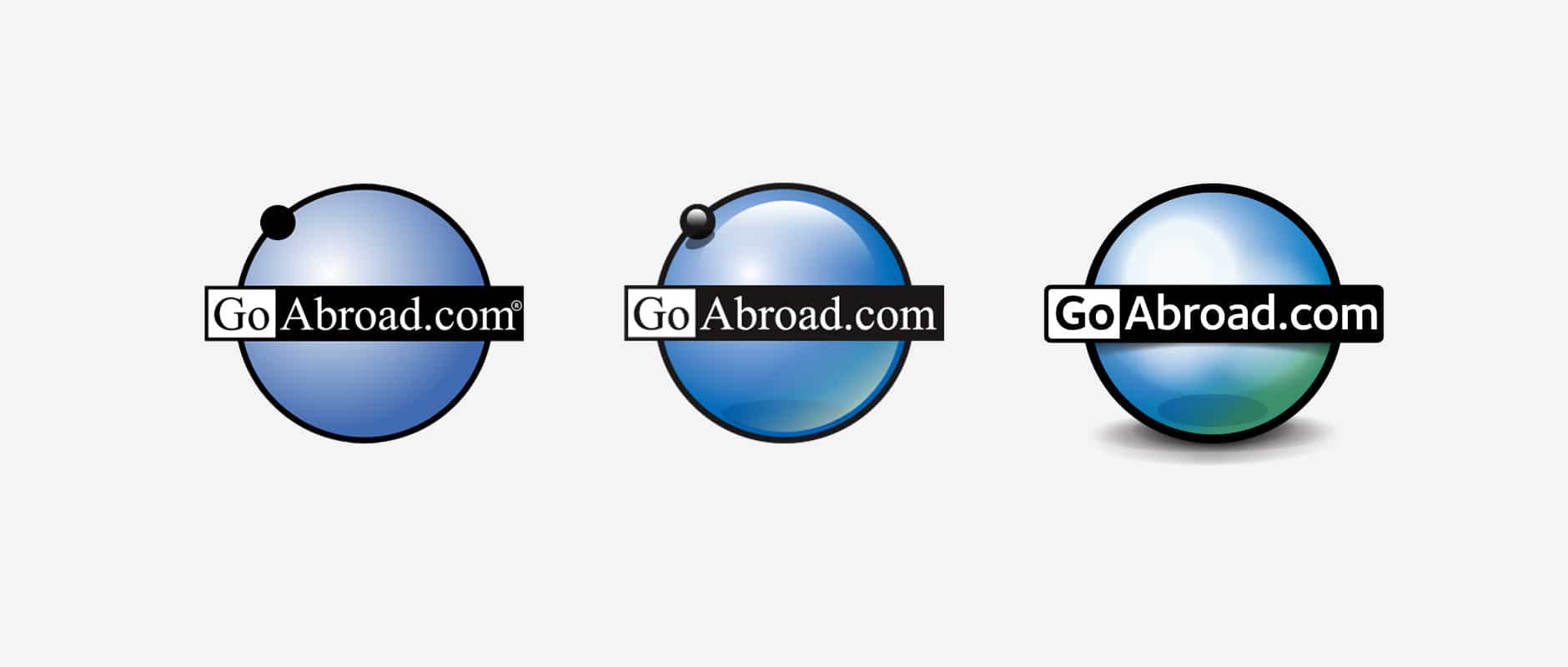
Their logo, having been with them and served them well from the start, was showing signs of age and required an update. The client had requested that their brand required modernising to stay relevant and fresh against their competitors whilst retaining elements of the brand that would be recognisable to their existing client base.

We approached this by starting to look at minor changes to the choice of font, choosing a sans serif font over their old serif font, rounding and smoothing the lozenge and reworking the main globe element. Both the full round logo and also a simplified and horizontal format lozenge were created to provide full range of application across both print and digital uses.

The result was a logo rework that remains identifiable to their customers and clients but brought into the modern day by subtle alterations to its form, colour and typography.

CISaustralia

CISaustralia send student all over the world on volunteer and study abroad experiences. They want a refresh to their logo and branding that was simple but modern and more appealing to their market.

We needed to retain the basic implication of a global business by keeping or expanding upon the sphere shape elements but since CISabroad had expanded their operations to cover significantly more locations I opted for the interconnected strands forming the sphere. As CISabroad had also started controlling their on the ground operations we needed  away to differentiate those locations as you can see in this example.